拥有无限潜能的前端导航项目
前端三件套,首先当然是——
搞什么开发,当然是先需求分析
需求分析
前端导航一般都有两个主要功能
- 搜索
- 快捷标签页
通过墨刀作图,可以得到如图原型图
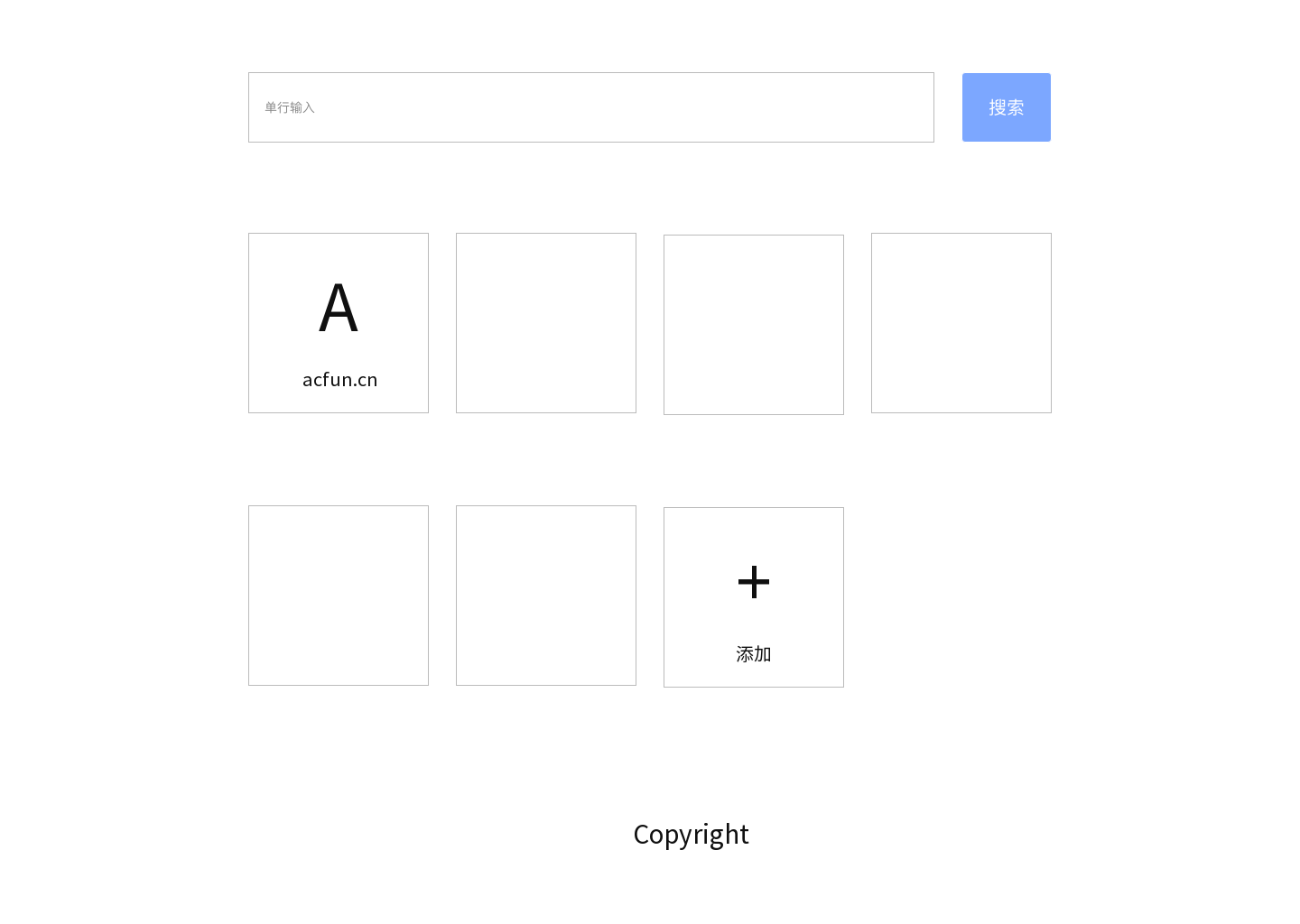
页面结构
得到产品原型图以后,分析一下页面的结构
首先能够确定的是两边留白,中间三行
大致就是 3x3 表格模样,特别适合 grid 布局
什么?兼容?想那么多干啥,先自己写出来,跑起来再说,2333
在 grid 布局中,用到中间一列,上部放置搜索框,中部放置标签页,下部放置授权标志
那大致可以得到如下 HTML
1 | <body> |
header 中包含两个组件,所以 header 应该写成如下模样
1 | <header> |
main 中包含多个标签页,数量不确定,行数也不确定,所以标签页决定通过 js 动态插入
然后新增功能需要一个新增窗口,先画原型图
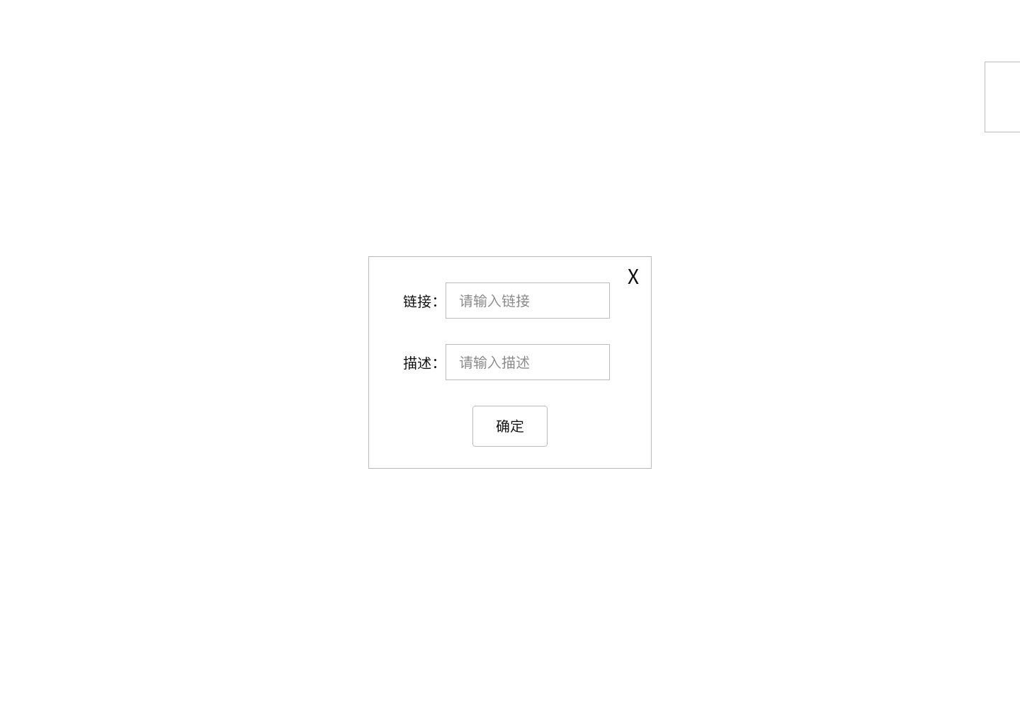
可见弹出窗口也需要一些组件,且需要用户通过”添加”按钮提供控制
所以可得如下 main
1 | <main> |
而 footer 的内容不是动态的,所以可以直接写死
1 | <footer> |
最后再引入对全文操作的 js 文件,可得全页面的 HTML 如下
1 |
|
接下来开始写CSS
CSS
全局初始化
先 fix 一下默认的样式
1 | *{ |
然后为 body 选择一个合适的灰色
1 | body{ |
定位
然后就是定位了
- 大小,显然要占满全屏,100vh 和 100vw 安排上
- 滚动条肯定不给左右给上下,overflow 安排
- 说好的 3x3 布局,grid 安排
可以得到如下 CSS
1 | .app{ |
然后 app 里的 header main footer 都是要做居中的,3 个flex 安排上
1 | .app>*{ |
接下来给三个块分配 grid 空间
1 | header{ |
然后先来做 header 吧
搜索
header 包含两个框,输入和按钮,并且还要居中
所以决定用一个 div 包住这两个,然后把 div 居中,里面一左一右摆放
先做个定宽居中 div
1 | .searchBox{ |
之所以这里不用写居中,是因为容器 header 已经定义了 flex 居中了
然后写搜索框宽度,显然这个是自适应的
那么反过来,先决定 button 的样式
首先让 button 宽 80px 吧
然后为了 button 好看,一般会给 padding
接下来背景色给个浅蓝色吧,同时字给白色(为了看得见)
这边框好丑,我要给白边加圆角
现在就还挺好看的
然后给一下上下 margin,以及为了同行显示的 inline-block,可以得到如下 CSS
1 | #submit{ |
再来做一个搜索框
首先给个 padding 让字显示位置不要那么贴边
然后再和 button 一样弄好看点
最后再弄个计算宽度来自适应
可以得到如下 CSS
1 | #keyword{ |
搜索就做好了!
主容器
首先要让弹窗不能影响我们的布局,于是把弹窗显示去掉
display: none; 即可去除
之所以选用 display none,是因为它不会渲染到页面上
而 visibility hidden 虽然不保留事件,但还是会渲染到页面上占据空间
opacity 更离谱,事件都还留着
然后开始做主容器内容
显然主容器的每列是平均布局,有多列
多列适合 flex column,但是平均布局不能用 space-between,否则空间分配会失常
所以先得到容器样式
1 | .container{ |
接下来每一个标签页,都有自己的一张卡片一样的样式
在卡片中,也有 logo、description、叉叉等三部分内容
其中叉叉是绝对定位在右上角的,前两个则是纵向居中排列在卡片中
可以得到卡片样式
1 | .card{ |
这里给 margin 预留了足够位置,所以不需要使用 负 margin 法 来平衡
然后给叉叉定位
1 | .delete{ |
因为平时没选中的时候是看不见叉叉的,所以 visibility: hidden;
然后定义 logo 样式,此处我使用文本而不是矢量图
1 | .logo{ |
慢着,描述变长的时候,描述怎么换行了?
给描述上一个不许换行的样式
1 | .desp{ |
接下来定义选中卡片的时候的行为
显然选中的行为一般都是变大或者上浮,此处选择上浮
1 | .card:hover{ |
上浮不能太突兀,给卡片加个过渡动画吧
1 | .card{ |
当选中的时候,叉叉也要能看到才对
1 | .card:hover .delete{ |
但是这时候,点叉叉还是点不到,怎么回事呢?因为叉叉浮起不够高,点到别的了!
让叉叉浮起来
1 | .delete{ |
OK,主容器部分做好了
弹窗
弹窗有几个要点
- 绝对定位在视口中央
- 三列内容,纵向居中排列,加一个叉
- 当它显示时,按键等级(层叠上下文)要比主页高
于是可以得到如下 CSS
1 | #tab{ |
至于 z-index 为什么是 1 呢?
因为我们刚才给 container 里的 card 里的 delete 赋值了 z-index=1,所以导致 container 的层级也升高了,所以这时候 tab 的 z-index 要不低于 container,才能浮在 container 上方
接下来为了方便布局,让所有内部子元素都以块级元素形式显示,并设置上下边距
1 | #tab>*{ |
tab 里的 delete 和 card 里的不一样,默认是显示的
1 | #tab>.delete{ |
再修整一下 tab 里元素的样式,弄好看点
1 | #url,#desp{ |
响应式
我们刚才都是以 PC 端为基准开发的,现在要支持移动端,怎么办呢?
答案就是一个媒体查询就完事了
分析可得在移动端,容器的 3x3 布局变为 1x3 布局,card 也最多只能排列下两个
所以可得 CSS
1 | @media (max-width: 600px){ |
响应式这样就完成了,不错吧?
JS
基本的骨架弄好了,现在要赋予这个项目血肉
搜索
从上到下,第一个就是搜索
很简单,只要研究一下百度的搜索格式就可以了
1 | function search() { |
注意搜索中要改一下默认的 http 字符转义问题,一般是空格转换成 %20 就行了
标签页渲染
然后是最重要的标签页渲染的功能
为了体现效果,此处先多搞几个重复的标签页
1 | let base_navs = [{ 'href': 'https://ringoer.com', 'desp': 'Ringoer\'s Site', 'logo': 'R' }, |
接下来,渲染到页面上
首先读取列表里的每个项目
1 | let container = document.querySelector('.container') |
然后在最后加上”添加”标签页
1 | container.appendChild(createCard(navList.length, '/', '添加', '+')) |
逻辑就完成了
那么来看看 createCard 方法
1 | function createCard(i, href, desp, logo) { |
先动态创建 card,然后根据是不是”添加”标签页,来动态绑定事件并插入子元素,最后返回 card
为了可以正常打开 tab 页,”添加”标签页的 click 事件让 tab 页的 display 从 none 变成了 flex,就可以显示了
可以看到里面提及了 delete 按钮拥有的 delete 事件
1 | function deleteCard(i, event) { |
这里一定要阻止冒泡,否则事件一旦冒泡,就会触发 card 的点击事件,导致虽然删除了 card,但是发生了跳转
这时候发现,我刷新一下怎么就重置了??
所以要保存用户使用数据
为了方便起见,这里保存到 localStorage
在初始化的时候先读取内容
1 | let navList = JSON.parse(localStorage.getItem('navList')) |
然后在每次渲染之后都存数据
1 | localStorage.setItem('navList', JSON.stringify(navList)) |
这样就可以得到完整的 draw 方法
1 | function draw() { |
这样渲染功能也大功告成了!
新增
最后是 tab 页提供的新增功能
分析需求可得
- 只允许 http 或 https 开头的 url
- 取 url 去掉协议后的第一个字符作为 logo
- 渲染到最后一个,但还在”添加”标签页之前
于是可得如下 js
1 | function insertCard() { |
这是主要功能,但是这个 tab 页还得支持关闭呀
1 | function cancel() { |
重新 none 就好了
ok,运行试试吧,这就是你的前端导航项目
改进
其实简单的项目还有很多值得改进的地方
比如我这个写法,并没有完美复刻设计图
大致有以下改进点
- 完美复刻设计图
- 改用 vue 或 react 做这个项目
- 支持用户在线保存设置
- 改善 logo,支持图片
以上点就够喝一壶了2333
那就到这里了
感谢阅读