官网做好了,现在开始做核心组件吧!
先创建一个 src/lib 文件夹,用来存放所有的组件
然后创建 Button.vue,开始制作 Button 吧!
需求分析
惯例先行需求分析
- 多种类基础 Button,包含警告、成功、危险等
- 允许设置 Button 为禁用状态
- 不止有传统 Button,还可以有文字或链接形式
- 当处于加载中,Button 应当显示
- 有不同的尺寸可供选择
- 应当允许更换颜色
- 当鼠标放置于 Button 上、鼠标按下未松开、处于加载中等状态时,应当变更背景色
- 允许用户自定义 Button 上显示的文本
那么可以整理出以下参数表格
| 参数 | 含义 | 类型 | 可选值 | 默认值 |
|---|---|---|---|---|
| level | 默认类型 | string | default / plain / primary / success / info / warning / danger | default |
| disabled | 是否禁用 | boolean | false / true | false |
| theme | 式样 | string | button / link / text | button |
| loding | 是否加载中 | boolean | false / true | false |
| size | 尺寸 | string | middle / small / large | middle |
| color | 颜色 | string | 任意合法颜色值 | #f3678e |
第 7 条,可以通过设置一个遮罩层来实现,只要遮罩层变色,背景色也等效变色
第 8 条,可以通过插槽实现,注意 vue3 不建议使用具名插槽
骨架
容易得到如下骨架
1 | <template> |
首先,本质应当是一个 button 元素
在此基础上,将参数列表中整理出来的每个参数,都使用 v-bind 绑定到 button 上
注意,此处绑定 color,必须是如上例一样,绑定到 --color 属性上,才可以在 css 中使用 css3 语法 var() 读取,在 css 小节会再解释,此处略
之后,在 button 内
- 放置一个遮罩层,用于变色
- 放置一个”加载中”的动画,用于在加载中状态下显示
- 放置一个默认插槽,用于传递用户自定义的文本
然后为上述元素配置各自的 class 名称,骨架就完成了
功能
显然,参数列表中整理出来的内容,一定来自引用该组件的地方的传入
先根据参数列表,写好 ts 声明
1 | declare const props: { |
然后在 export default 中,写入我们的参数
1 | export default { |
ok,组件功能也完成了
什么?你说属性绑定完成了,事件绑定怎么办??
那个不用担心,在外部传递到组件的事件,在组件只有唯一根元素的情况下,是会自动绑定到根元素上面的,所以现在这样基本就完成了
样式表
然后补全样式表
注意,UI 库的样式表一般不要加 scoped 修饰符,为了尽可能减少对用户样式表的影响,方便用户 DIY
建议直接打字抄一遍吧,一边抄一边理解比较好
特别注意,button 元素会有默认黑色外边框,不属于 border,必须通过 outline: none; 才能消除
然后,我们使用 css3 的 var() 语法,取得我们通过 js 绑定到 style 上的 --color 属性
为什么是 --color 而不是 color ?因为 var() 语法要求这个参数必须是 -- 开头,才可以正常访问到
对于遮罩层,采用淡出到白色即可实现,原理此处不解释了
最后,对于多种不同的 button,可以使用 scss 提供的 mixin / include 语法来实现
1 | $theme-color: var(--color); |
以上,button 组件就完成了
测试
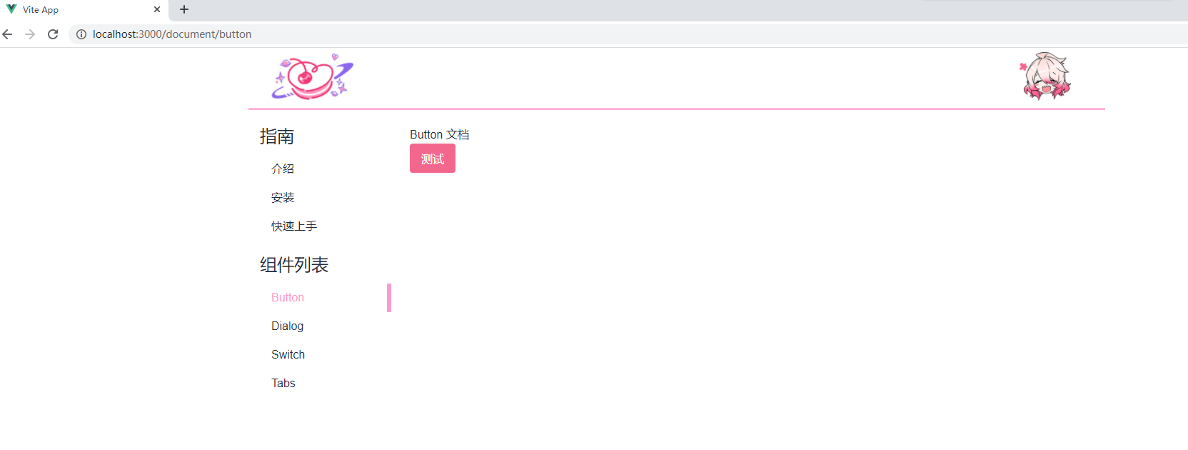
引入文档页看一下
1 | // src/components/Button.vue |
效果如图
感谢阅读