虽然现在官方文档基本快要完工了,但是也太难看了
让我们把它变得好看一些吧
markdown
如果用原生 html 慢慢写文档,也不太好控制排版了
我决定使用 md 来写文档
新建 src/markdown 目录,在里面新建 install.md 等三篇文档,然后写完整先
但是 vue 默认不支持 md,要想个办法让它支持
我们可以自己写一个插件,告诉 vue 如何识别 md 文件
这里直接给出插件代码
1 | // plugins/md.ts |
可以照抄,放在项目根目录下的 plugins/md.ts 就行
注意到,这个插件依赖 marked 这个 npm 库,记得先安装
1 | npm install marked --save |
不然就会在试图 run 的时候一直报无法识别 md 文件的静态错误
然后也是在项目根目录下,新建文件 vite.config.ts
1 | import { md } from "./plugins/md"; |
通过在 vite 初始化的时候,导入额外的插件(我们自己写的 md 插件),来识别 markdown 文件
最后修改一下三篇文档的视图,以 install.vue 为例
1 | <template> |
因为 vue 不能直接识别 md,所以不可以通过静态 import 来导入,只能通过动态 import
而动态 import 有以下两个特点
是异步的,必须要使用有监听的对象,才能自动重渲染
取回的内容,根据
export的字段而定默认
export default的情况下,就必须使用.default来取值才可以获得实际内容
最后,使用 v-html 绑定到模板即可
github markdown 样式
现在虽然正常引入 md 了,但是没有排版,还是丑
我们可以使用 github-markdown-css 这个库来获取样式表
1 | npm install github-markdown-css --save |
安装完成后,在 main.ts 中引入
1 | import 'github-markdown-css' |
最后,找到放置文档的地方,赋予 class="markdown-body" 即可适用 github markdown 样式
1 | <article v-html="md" class="markdown-body"></article> |
多组样例
一个 UI 库,每个组件不可能只有一个用例
所以我们要给每个组件都配多个用例,但是为了方便管理,不能写在一起
所以现在,新建 src/components/examples,然后把已有的几个组件样例都抽取为 [componentName][index].example.vue,再引入到文档页中
以 Button 为例,现在原本的 src/components/Button.vue,在原本之基础上新增了一个 src/components/example/Button/Button1.example.vue
1 | // src/components/example/Button/Button1.example.vue |
1 | // src/components/Button.vue |
使用我们制作好的 LabyCard 来充当容器
如上,把所有用例都拆分开
展示代码
好的 UI 库,不仅会给用户展示例,还会给出这个例子所使用的代码
可是怎么获得代码呢?
我们可以在 vite 初始化的时候做手脚——修改 vite.config.ts 即可
1 | // vite.config.ts |
可以使用如上代码,在 vite 初始化的时候,解析每个包含 <example> 标签的 vue 文件,将其 example 标签内的内容作为标题,其余部分作为源代码,附加到每个 vue 文件的 export 上
并且,因为我们不希望能被用户访问到,所以最好是使用双下划线开头的变量名,标识源代码和源代码之标题
注意,因为我们使用的是 typescript,在类型中可能不存在某字段的时候,会引发 ts 静态报错
可以通过 // @ts-nocheck 注释,来忽略静态报错
现在,我们就可以展示每个例子中的代码了
以 src/component/Button.vue 为例
1 | // src/component/Button.vue |
记得在 setup 中 return 一下,否则 component 和变量是不一样的,会访问到 undefined
然后,记得在 src/component/example/Button/Button1.example.vue 中,加入 example 标签
1 | <example>基础用法</example> |
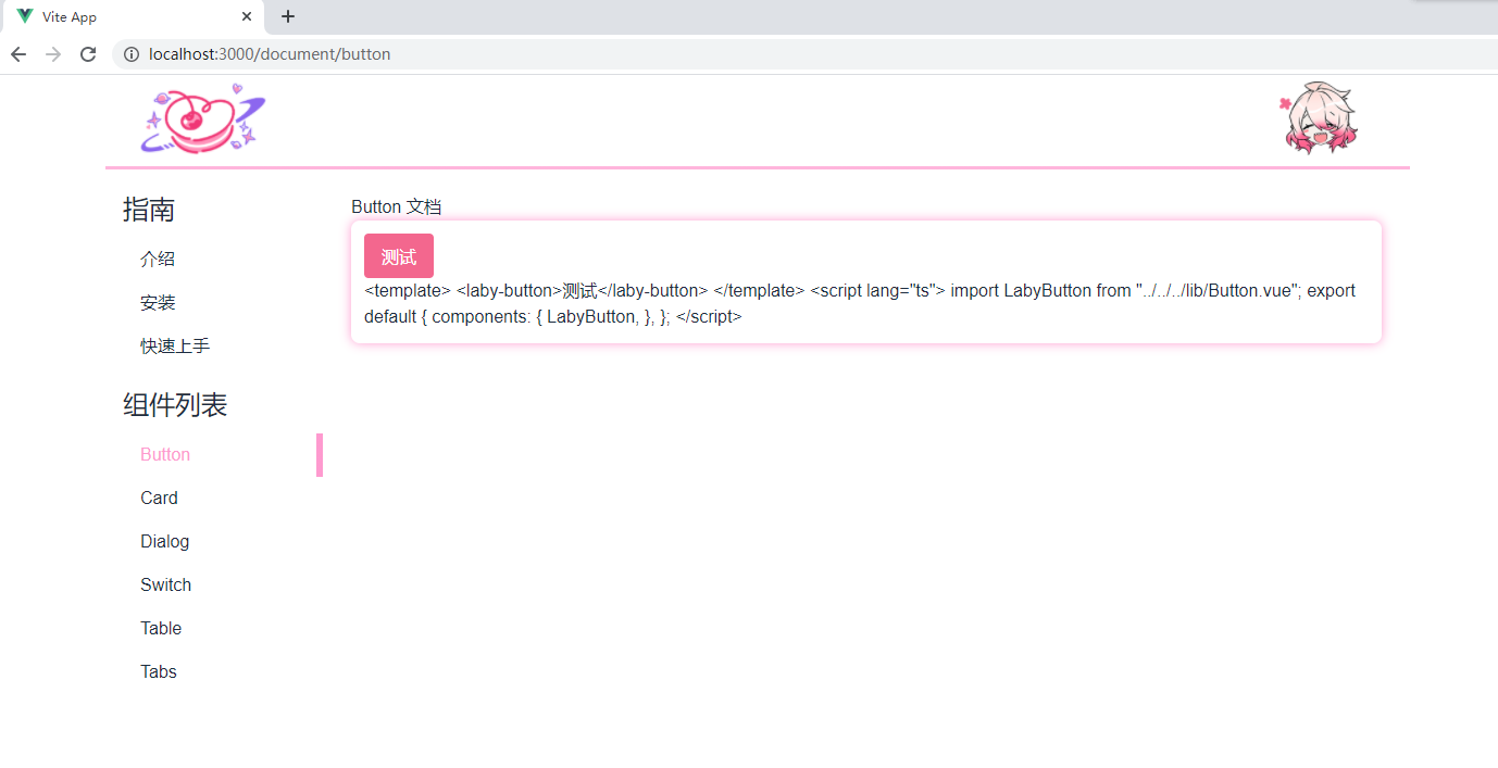
效果如图
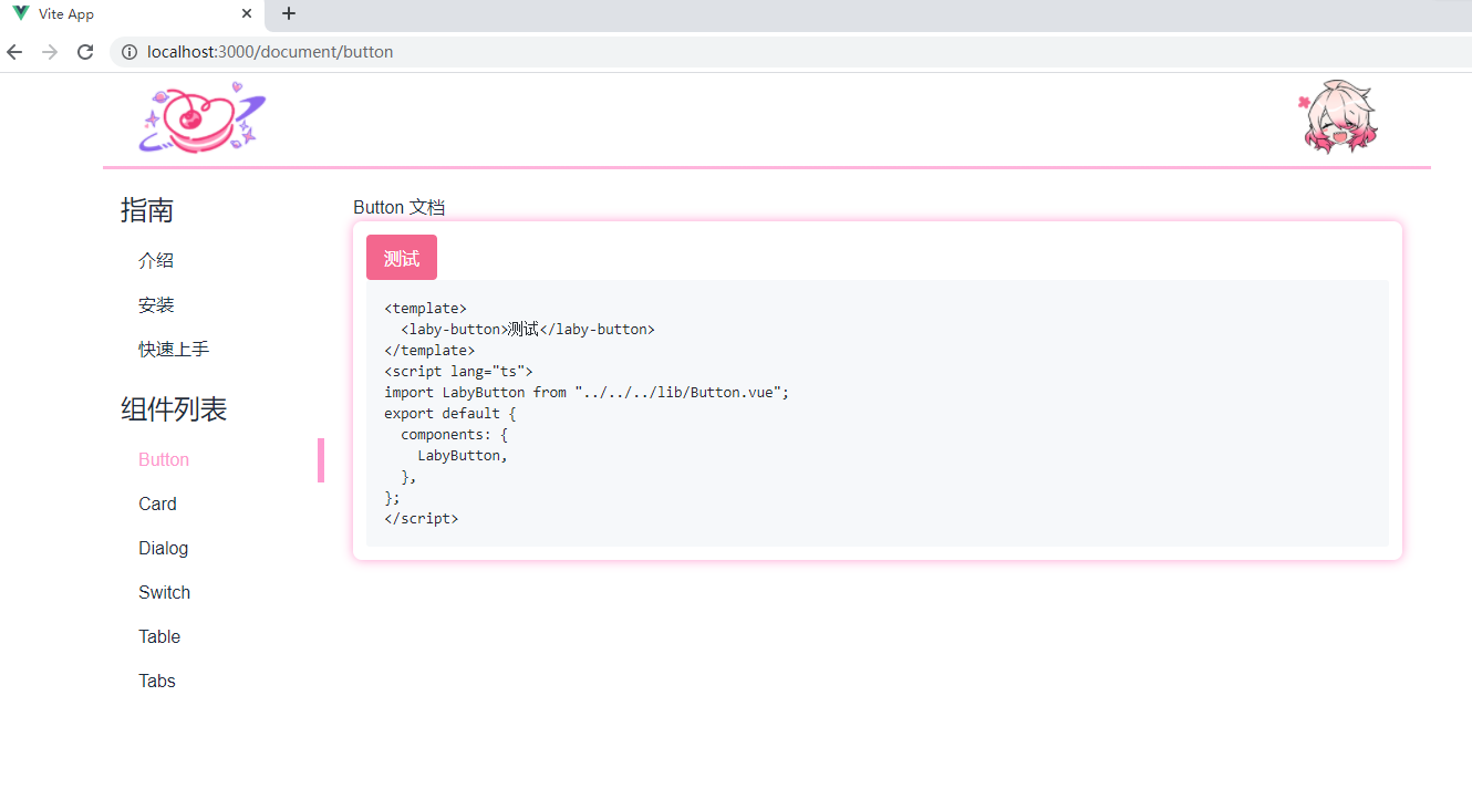
然后再用上我们的 github 样式,变为这样
1 | // src/component/Button.vue |
效果如图
代码高亮
但是代码黑乎乎的,还是丑
我们可以用 prismjs 库来获得代码高亮
先安装
1 | npm install prismjs --save |
然后在需要使用的地方,分别引入 prismjs 和 prismjs/themes/prism.css,即可开始使用
prismjs的工作原理,是构造一个对象,并绑定到 window 上,所以在模板中使用的时候,需要先获取 window.Prism,再在 setup 中 return 出去
Prism 对象的一个用例如下
1 | Prism.highlight( |
该对象上提供一个名为 highlight 的方法,该方法要求传入 3 个参数,按顺序分别如下
- 源代码
- 作为什么代码进行解析
- 作为什么代码进行显示(渲染)
那么还是以 Button 为例,可得如下代码
1 | // src/component/Button.vue |
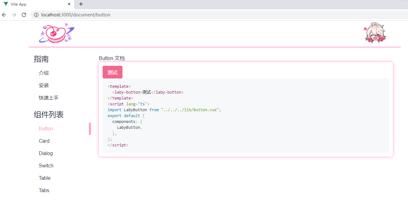
效果如图
照猫画虎,把每个例子都补上就行啦
展开/收束代码
加个打开关闭的功能就可以了
以 Button 文档页为例
1 | <template> |
再补上 显示代码 这个功能的样式表就 ok 了
1 | $theme-color: #f3678e; |
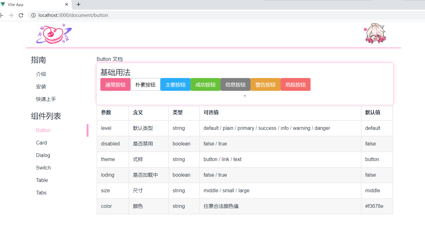
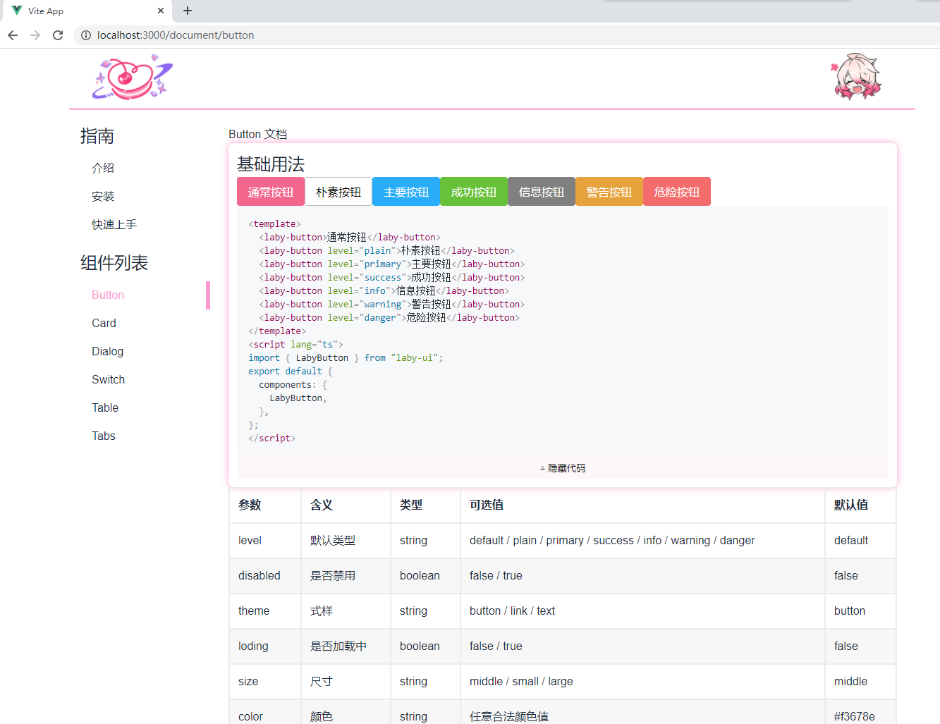
参数列表
用户光看样例,不知道参数代表什么含义,怎么可以
这里就可以用我们制作好的 Table 组件来展示样式表
引入 Table 组件,然后写好即可
1 | <template> |
效果如图
用户体验
因为用户使用你的库,不可能是从 lib 引用的,而是先 npm install 之后直接从 node_modules 引用,所以要像用户一样的使用,才可以尽可能发现用户使用中可能出现的 bug,提升用户体验
那么我们先要下载自己的库
1 | npm install laby-ui --save |
并在 main.ts 中引入样式表
1 | // main.ts |
然后修改每个例子中的引用
以 Button1.example.vue 为例
1 | import { LabyButton } from "laby-ui"; |
效果如图
感谢阅读