大多数网站都有的标签页
需求分析
惯例先行需求分析
- 可以选择标签页排列的方向
- 选中的标签页应当有下划线显示
- 切换选中时,下划线应当有动画效果
- 应当允许更换颜色
那么可以整理出以下参数表格
| 参数 | 含义 | 类型 | 可选值 | 默认值 |
|---|---|---|---|---|
| direction | 方向 | string | row / column | row |
| selected | 默认选中 | string | 子项的 name | 必填 |
| color | 颜色 | string | 任意合法颜色值 | #f3678e |
通过为子项设置 name 属性,来指定默认值
骨架
本体
容易得到如下骨架
1 | <template> |
使用一个单独的 div 来充当下划线,并且使用一个新的 component 来显示用户输入的内容
那么既然标签页叫做 Tabs,那我们就新建一个 Tab,命名为标签,用来当做子组件吧
子组件 Tab
容易得到骨架
1 | <template> |
显然只有一个参数,就是标题,所以有如下 script
1 | declare const props: { |
功能
先 ts 声明
1 | declare const props: { |
然后在 export default 中,写入我们的参数
1 | export default { |
再补全 setup 方法
1 | setup(props, context) { |
注意,除了定义之外,还附加了很多验证,详情见注释
样式表
然后补全样式表
1 | $theme-color: var(--color); |
测试
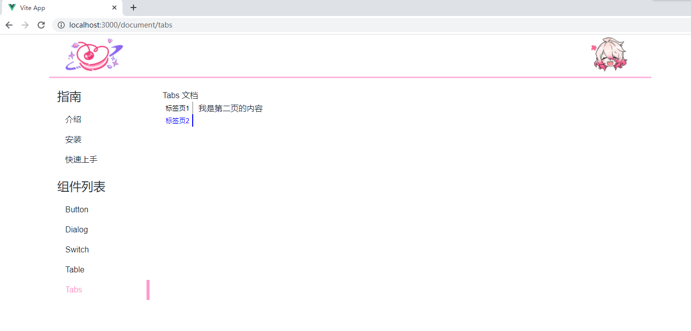
引入文档页看一下
1 | // src/components/Tabs.vue |
效果如图
感谢阅读